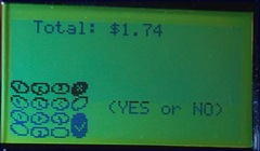
Down below you’re given the choice of a bunch of black buttons or:
a red button with an “x” on it,
- a yellow button with “<” on it or
- a green button with an arrow on it.
Take your best guess: which button means “YES”?
I can excuse the people who have asked “Which one means YES?”, after all there is not an actual button that has YES written on it. Although I still find it amusing that they even have to ask.
But where on God’s green earth does a red button with an X mean YES? And why get mad at me when you have to get your card out of your wallet and swipe it again because you thought that’s what it meant?


3 comments:
My question would be "Who the heck designed such a stupid thing?" Why on earth couldn't they put "yes" and "no" buttons on if those were the required responses? How dumb is that?
And what's the yellow button for -- yes, but charge my card slowly and with caution?
The yellow button is the back button, so if you hit the wrong number when entering your pin number, you can back up one or two and re-enter them. You're right about actually putting "yes" and "no" on the buttons, but I still think that if someone is going to make a guess, why would they guess the red X for yes?
Yes, I see your point that red X is unlikely to mean yes, but it's still not the most logical set up.
Post a Comment